The Impact Matrix
Effective risk oversight is critical to delivering projects on time, on budget, and without unwelcome surprises. The Impact Matrix Dashboard gives project and portfolio managers a powerful, visual way to stay on top of risks - not just within a single project, but across the organisation.
Rather than wading through registers or scattered reports, the matrix provides a clear, consolidated view of where risk is building and where attention is needed. By plotting each risk against its impact and probability, it highlights which issues pose the greatest threat to delivery and strategic objectives.
This isn’t just a tool for individual PMs. For PMOs and senior leadership, the matrix enables quick, informed decisions about where to intervene, where to allocate mitigation effort, and how to align governance around what matters most. It supports better conversations, clearer prioritisation, and a shared understanding of risk exposure at every level.
The matrix uses each risk’s rating, calculated from its impact and probability values, to position it within the view. If you're looking for detail on how risk scoring is configured, this article explains how impact, probability, and risk rating values are set.
The Impact Matrix Dashboard
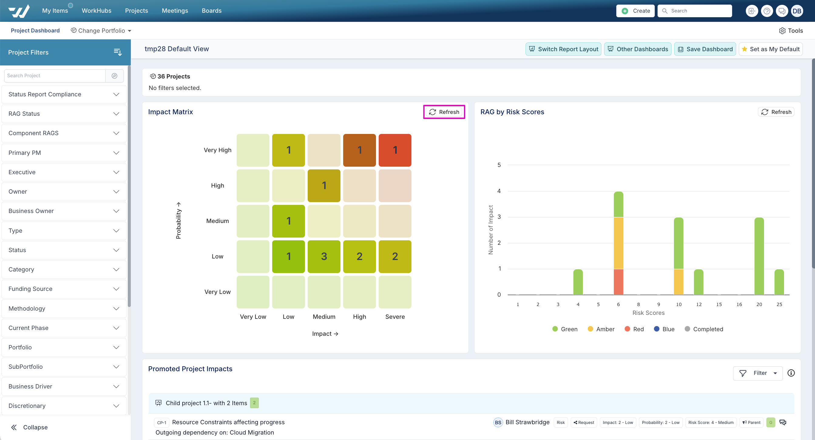
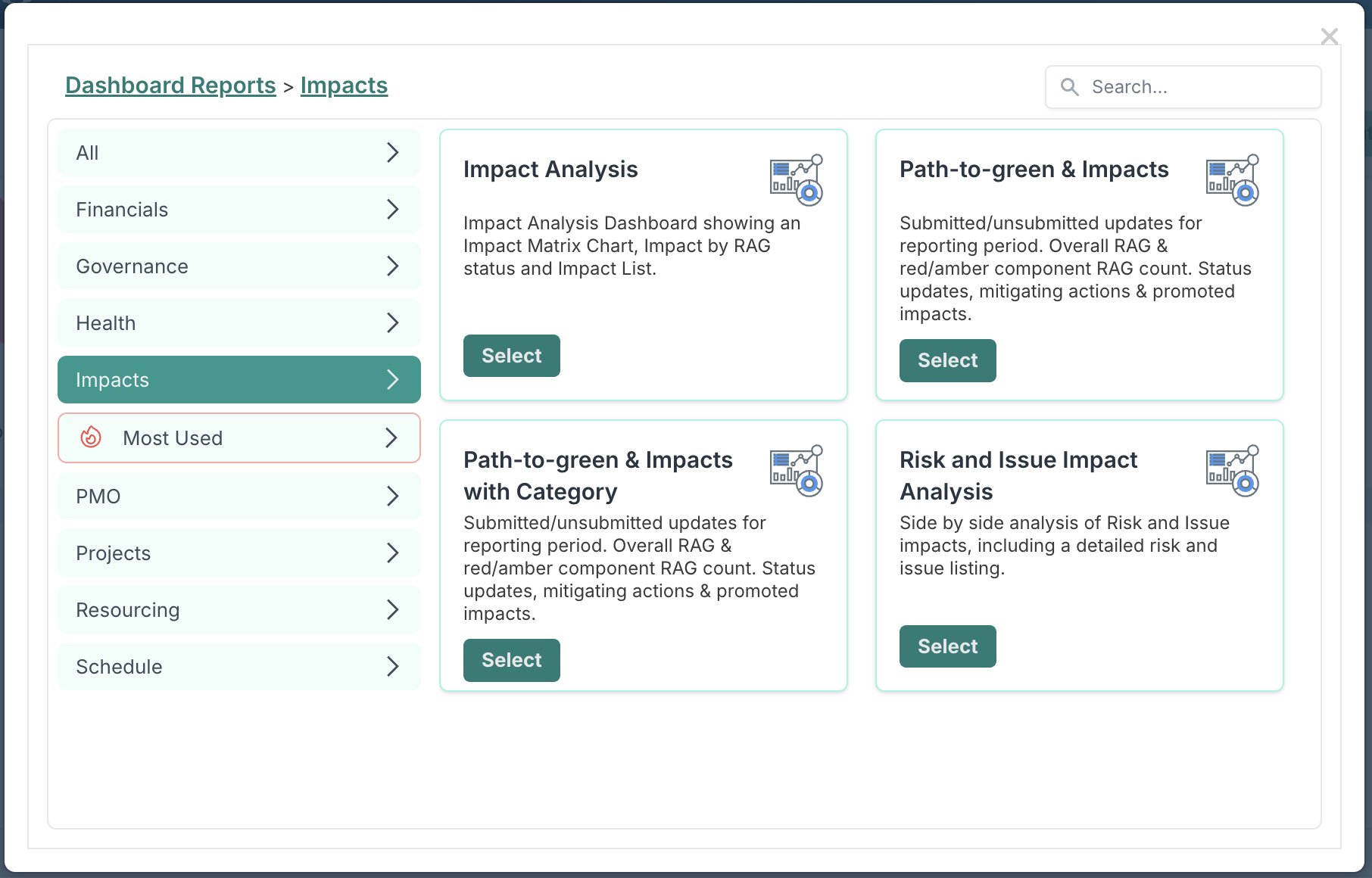
To access dashboards that include the Impact Matrix, go to any project dashboard, select 'Switch Report Layout', and choose a dashboard under the Impacts category.
At the heart of these dashboards is the Impact Matrix - a visual tool that helps you quickly understand how risks are distributed across your portfolio. It maps each risk based on its probability (Y-axis) and impact (X-axis), with the matrix size reflecting the scales your organisation uses. This might be a 5x5 grid as shown here, but it could vary depending on your risk setup.
Each cell is shaded using a heatmap gradient, from light green to deep red, depending on the severity of risks in that cell. This shading makes it easy to spot where higher-risk items are accumulating and where attention is needed — without needing to read through detailed logs.
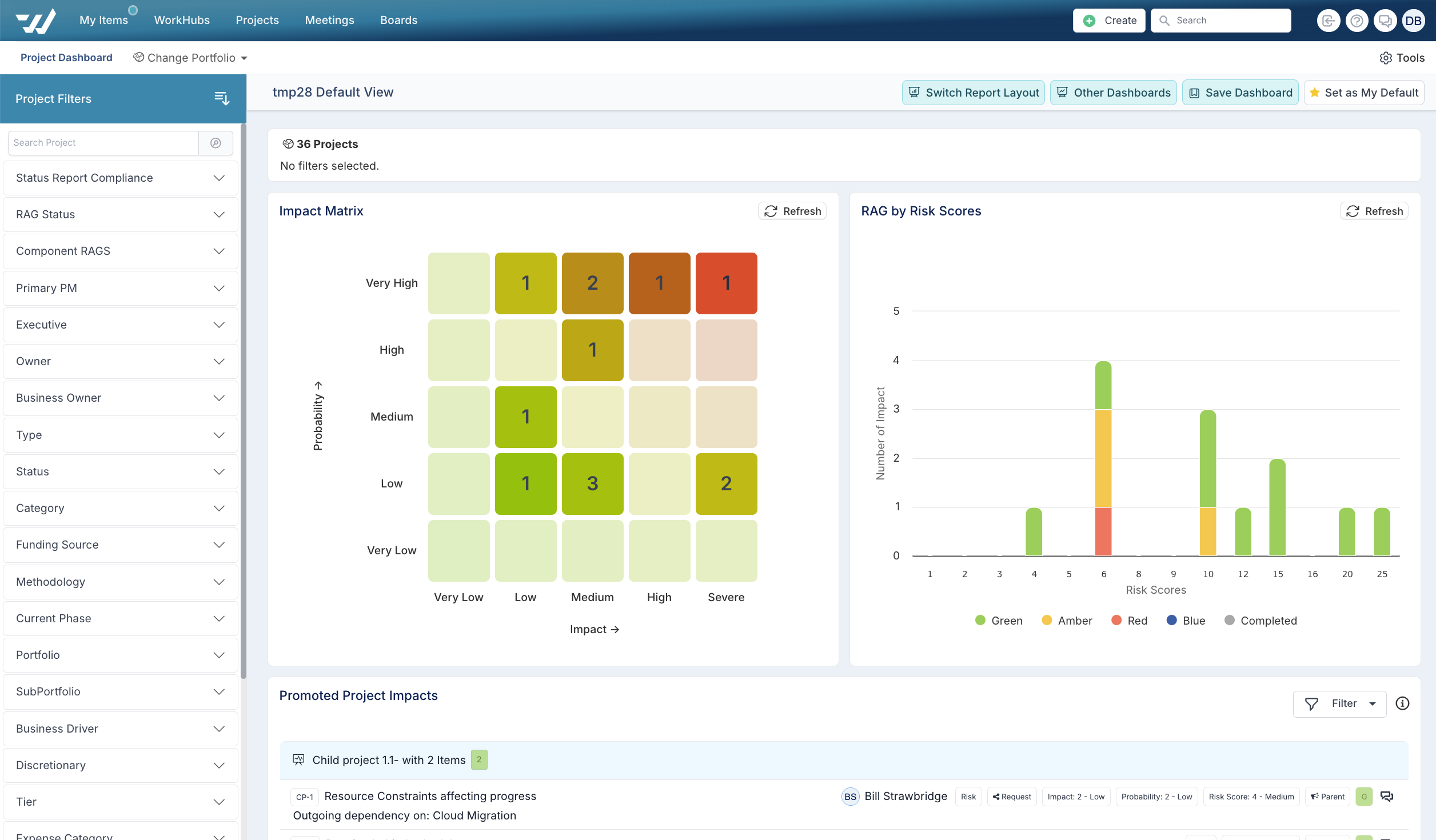
The matrix is fully interactive. Clicking on any tile filters the rest of the dashboard, allowing you to drill into the exact risks that fall into a particular category. It’s a practical way to shift from portfolio-level visibility to actionable detail in just a click.
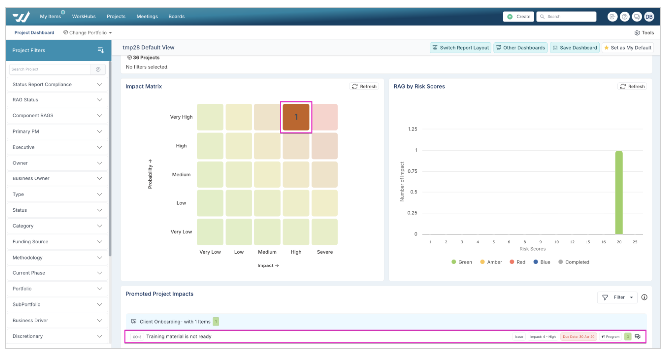
To clear filters on the dashboard, hit refresh in the impact matrix chart.